Dashboards
Dashboards
There are many ways of visualising the metrics Reaper exposes. Here is just a few examples to get you started.
We are going to use Grafana to visualize metrics fetched from a Prometheus backed. We will also assume the metrics were relabeled.
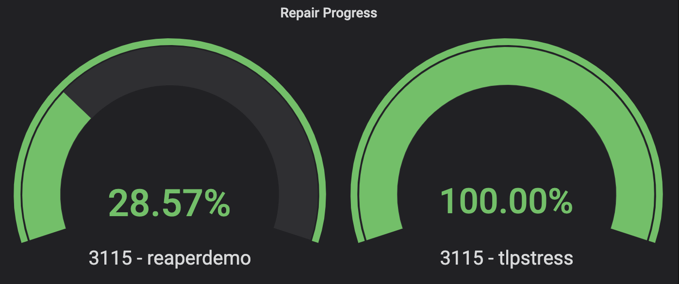
Repair progress
One of the simplest things to visualize is repair progress. We can do that using a simple Gauge, where we use use the following query:
io_cassandrareaper_service_RepairRunner_repairProgress
To make the panel more pretty, we can enter the following in the Legend field:
{{cluster}} - {{keyspace}}
With two keyspaces doing repairs, we should see two dials, one for each keyspace:
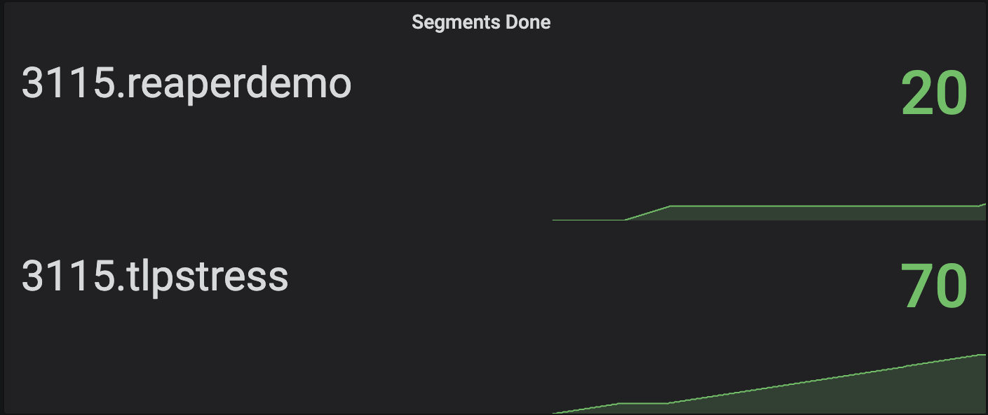
We can now switch the Gauge visualisation for a Stat one, which will give us the repair progress, but also a small graph showing the progress over time:

To monitor the repair progress in terms of the number of repaired segments, we can use the following query:
io_cassandrareaper_service_RepairRunner_segmentsDone
Again, we put this query into the Stat panel, but we also select Last for the Calc field in the Display part of the Visualization tab. We should get a chart that looks like this:
Segment duration
When monitoring repairs, we would like to know how much time it takes to repair a segment. As a rule of thumb, we would like each segment to take 10 to 15 minutes. This indicates the segments are big enough to not waste the overhead of a repair session and minimise over-streaming, while not being too large to risk streaming timeouts.
To check segment durations, we will use the SegmentRunner_runRepair metric. This metric is a timer covering the duration from the moment a SegmentRunner wakes up to repair a segment until the segment finishes. In this case, we will use a Graph and feed it the following querry:
io_cassandrareaper_service_SegmentRunner_repairing{quantile="0.5"}
Unlike previous examples, here we add a filter to explicitly pick the 0.5th percentile because we are interested in the majority of the segments, not just the longest ones. Reaper already gives us this duration in seconds, so we pick Seconds (s) as a Unit for the Left Y axis in the Axes section of the Visualization tab. We should end up with a graph that looks like this:
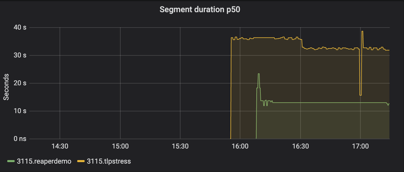
We see our segments are taking ~30 seconds, which is way below the desired ~10 minutes. We should tweak our repairs to use less segments.
Segments per hour
For the last two graphs, we’ll try something harder. We’ll try to plot the number of segments repaired per hour.
We create another Graph panel and feed it a query like this:
(increase(io_cassandrareaper_service_RepairRunner_segmentsDone[1h]))
The above simply means we ask Prometheus to give us the increase of the given metric in a 1 hour window.
Next, we enter 1h as a Min step in the query tab (it’s next to the Legend field), and we set 24h as a Relative time. In the Visualization tab, we select to draw Bars and turn on stacking. We should end up with a graph like this:
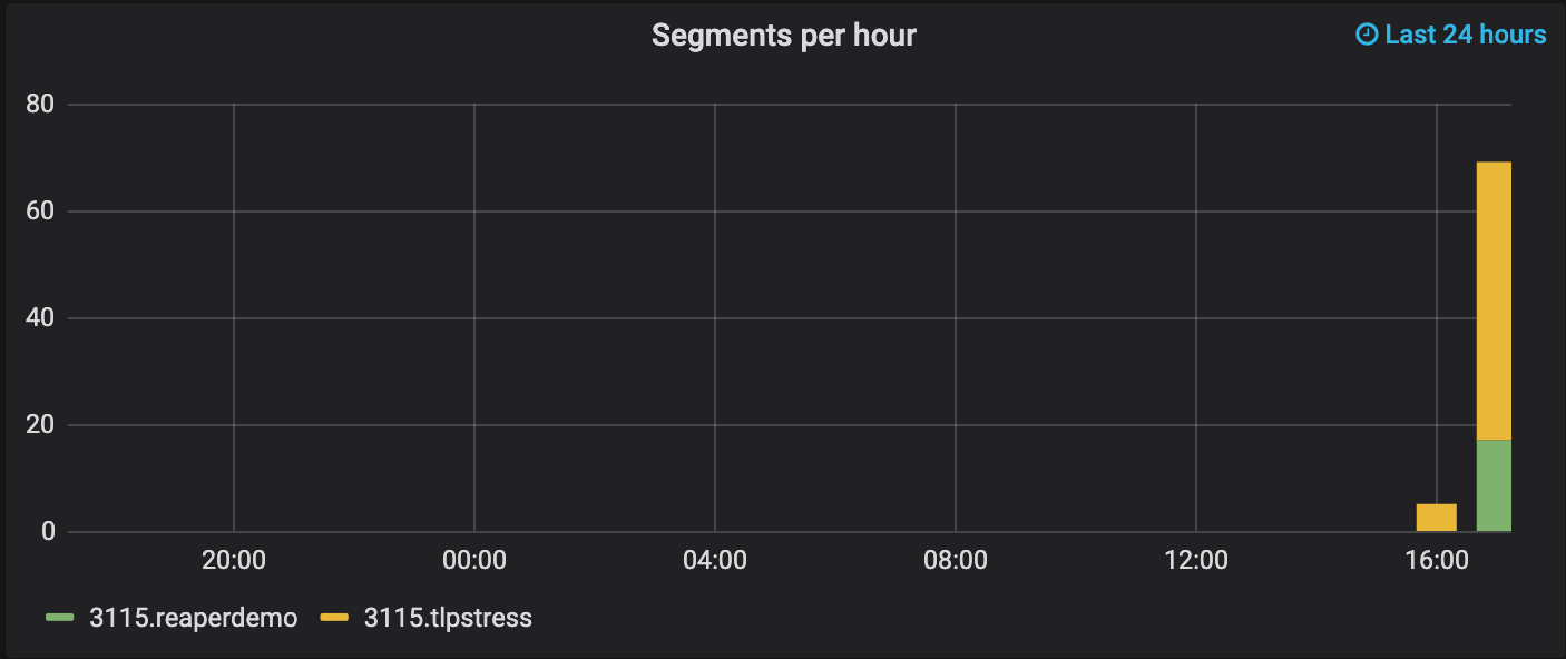
Note that the panel now says it tracks the last 24 hours in the top right corner - this is because of the relative time we selected. Also, even though it’s not obvious from the graph, Grafana will draw a bar only after that hour passes. In other words, you might need to wait a bit before you start to see your bars.
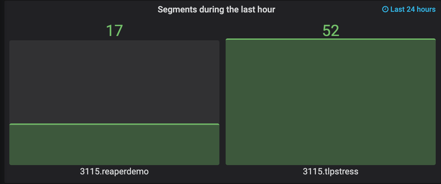
Segments in the last hour
Finally, we can also plot the number of segments repaired in the last hour only. We use the same query, min step and Relative time as before, but this time we put it into a Bar Gauge with a vertical orientation. We should see this:
Repair schedule cycle violation
Since different schedules can have different run intervals, detecting cycle violations requires different rules that would be schedule specific.
The io_cassandrareaper_service_RepairScheduleService_unfulfilledRepairSchedule introduced in v4.2.0 provides a 0/1 metric per repair schedule to notify if a schedule hasn’t completed a repair within the configured interval, whichever the interval is.